3 Must Haves for Your Kidmin Area
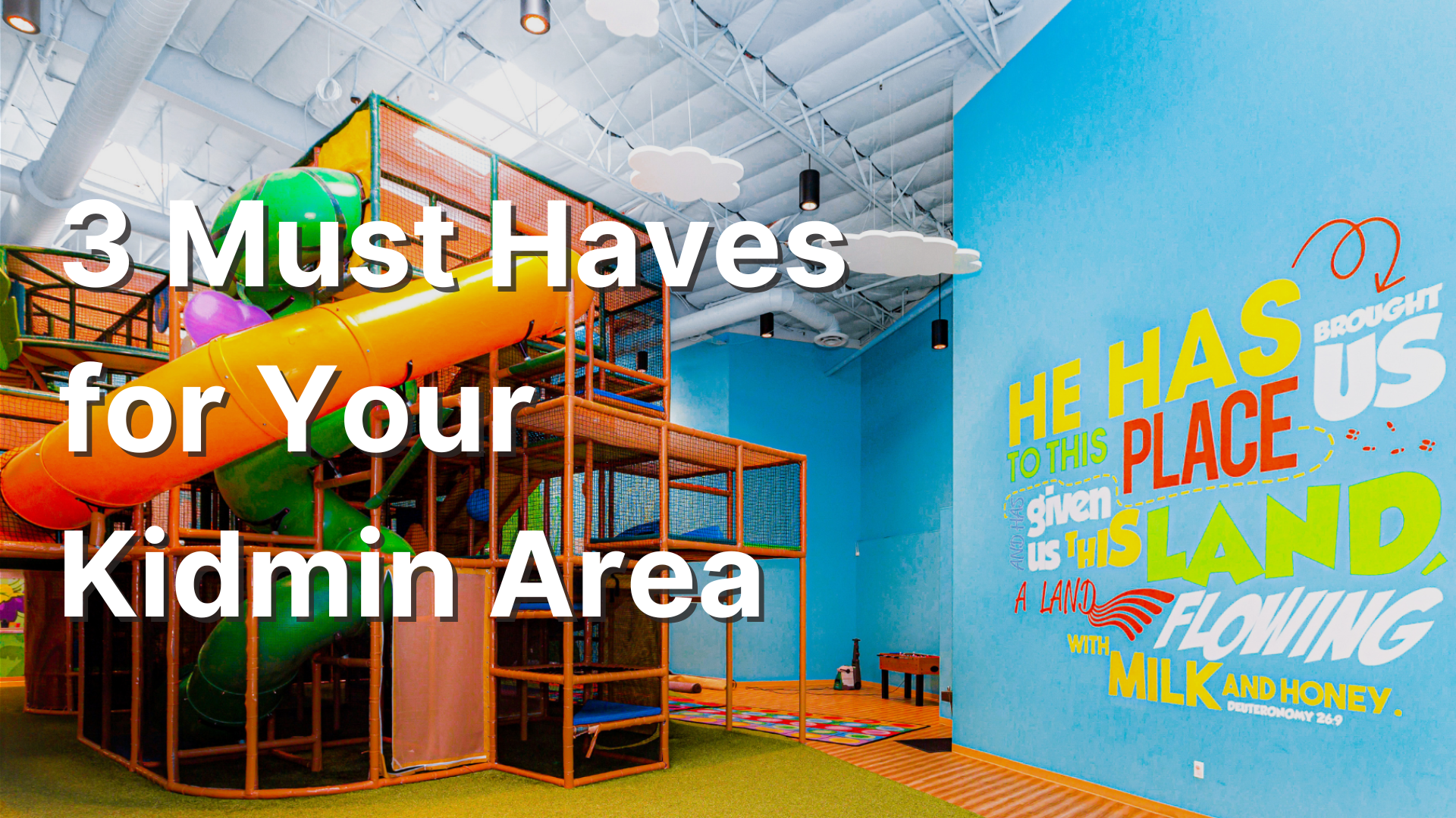
Photo from Awaken Church on Worlds of Wow
Picture this, you’re given free reign to create your perfect Kidmin space. Whatever theme for décor? You get to do it. However many classrooms? You can have them. Whatever kind of seating? Here you go.
Sounds like a dream, doesn’t it? For many of us in the church world it is. We look at our own facilities, sometimes a hand-me-down from the adults, and see all the flaws. We look at the state-of-the-art facilities at the biggest churches in the world (have you seen Worlds of Wow website?!!) and are filled with envy.
I know those feelings all too well because I’ve been there. My kids’ church in church number 1 and 2 was the old sanctuary. The carpet needed to be replaced 10 years before and there were still remnants of the adult service tucked into dusty corners. They were far from Six Flags over Jesus, but I made do with what I had.
Looking back at my own facilities and touring churches all over the country, I’ve discovered 3 must haves for any kidmin space. Whether you’re starting off fresh or just trying to make your space better, you can do something to make it pop. Here are some ideas.
3 Must Haves for you Kidmin Area
1. Restricted Access
In this post, I talk about the 3 essentials for children’s ministry. The first essential is safety. This is the parents, and by extension the kids, first concern and for many the biggest. When parents drop off, we have to project that this space is safe to leave your kids that nothing will happen to them while you’re gone.
The message starts in the parking lot, but your check-in/lobby area is the biggest sender.
An easy first step is to have restricted access. You don’t want kids, parents, or other adults just walking in and out of your area. This can be accomplished in a variety of ways, but the easiest is to place a volunteer at the door that lets kids in and keeps everyone else out.
I once spoke with an army officer who worked security at an FOB in Afghanistan. He told me that they create safe zones. There is a restricted entry point that only authorized personnel can enter and then it’s free reign inside.
We see this strategy all the time at large venues and even in stores. Those signs that say Employees Only are as much for your safety as theirs.
If I had to start from scratch, I’d have one check-in area for all ages that then funnels kids and parents by age. Since parents of babies need to physically drop off in the room and frequently have a conversation with the volunteer, they can go all the way to the door of the room, but not enter. The parent meets the volunteer at the Dutch door, where the top and bottom of the door can swing independently, and pass off their child, belongings, and instructions through the open top.
The Dutch doors would continue up through preschool as parents drop their kids off in the correct rooms. When you get to older preschool, a volunteer can meet the parent and take the kid to the correct area.
For elementary, the kids can be released through one door and enter their room. At one church in Atlanta, each elementary kid was assigned a color according to their age group and all they had to do was follow color tiles to their room, where the doorway and accent color on the wall was the same color. It made it super easy for parents and adults to figure out which way to go.
None of the churches I’ve served in have had this set up, but I’ve done a lot with stanchions and volunteers to create safe areas, walkways for parents, and pick up and drop off lines. Get creative and you can make it work.
2. Versatility
At church number 3, they designed the space to look like Nickelodeon studios in the 90s complete with crazy carpet and stadium seating. The risers were large and carpeted, but not designed to have chairs. The kids and volunteers sat on the floor. It allowed us to fit a lot more kids in the relatively small space, but it was fixed to that one configuration.
If I wanted to hold a volunteer training meeting in that area, there wasn’t enough room to set up tables and chairs, forcing them to sit on the floor. In addition, when we added small groups, there weren’t enough classrooms for all the groups, so we had to split in this room. Once again, the stadium seating was a hinderance. The space was so limited that before I arrived, they added an additional room to the building for kids to have free space to play.
When designing your space, you want to think about versatility. Is it a kid’s space? Yes. What happens if you want to do a meeting? Or design decorations for a play or VBS? If you outgrow the seating, what will you do from there? Will this be a multi-purpose room? Can it be?
Whatever your answers are to those questions, I advocate for a flat floor and moveable seating. Whether you use chairs, Easy risers, have kids sit on the floor or something else, you can do a lot of things on that kind of floor. The moment you add a slope or stair step, you’ve limited yourself.
If your seating is fixed, you’ll need to make do with what little flat space you have or find another room on campus that suits your needs.
At that same church with stadium seating, we used the multipurpose rooms down the hall for our small groups, volunteer and parent meetings, and decoration prep rooms, it wasn’t ideal, and I had to be mindful of the shared space, but it worked.
(A little disclaimer for church number 3. While I’m complaining about the stadium seating, it was the best kids space I’d ever served in and had a huge wow factor for kids and parents. Always be thankful for what you have.)
3. Free play space
At my first church, there was only room for the chairs and stage. So, when the kids arrived, I had them sit while I played funny videos until service began. It mostly worked, but a part of coming to church is building community.
Kids need and want to find friends. It makes the activity fun and keeps them coming back again and again. Most of those friendships, however, are formed during free time. So, we need to create a space for them to freely move about and socialize.
Most churches I’ve seen have a few arcade or board games in the back of their area for kids to play before and after service. Bigger churches have whole rooms dedicated to free play complete with slides and other playground equipment. Either way, they’ve intentionally created a space for kids to play, and play is kids’ work.
I like what Reggie Joiner says about fun.
“Having fun with kids convinces them that you actually like them.”
So, when designing your space or just modifying what you have, create a space for kids to freely roam. Provide games and activities that promote community like Legos or giant Jenga blocks. I’d caution on choosing video games. While they have an initial wow factor, they cost a lot, become obsolete rather quickly, and kids stare at the screen instead of talking to each other.
Designing a new kids’ space can be exciting but also scary. And reworking what you currently have can be frustrating. While looking at your space, don’t get caught in the comparison trap. Make the best of what you have. Following these principles will help.
Don’t get down on your space. I’ve seen the Spirit move in a brick hut with holes in the walls for windows and no A/C. He can move in your space as well.
What does your space look like? What have you done to make it better?


This downloadable kit will help you develop and deploy an effective volunteer onboarding process.